- cross-posted to:
- steam@lemmy.ml
- cross-posted to:
- steam@lemmy.ml
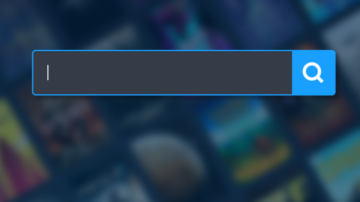
Man, I love two thirds of my screen being blank space…
I get why people are against the change, but there are many reasons why majority of websites do the same.
I can’t speak to the particular width limit steam has chosen, but if you take any website and remove width restrictions, you’ll quickly find out why.Trying to read a block of text? Now it’s a single line spanning your whole monitor.
Trying to scroll a gallery using a button on the side? You have to move your cursor across the whole screen to choose between left and right.
Want to look at various images? You now have to turn your entire head.
God help the designers if they try to put out a coherent set of visuals that works on 4:3 and ultra-wide* both.This didn’t really use to be an issue, but monitors and resolutions have gotten both huge and varied. It’s hard enough to accommodate mobile and desktop.
Steams audience is a prime example where catering to more extreme screen sizes actually makes sense.
The technology arrived a decade ago to do this.
Time to flip your screen 90°
Not a huge fan of them removing the quick access sidebar but I like all the other changes. I like not having to scroll all the way up to search anymore.
I’d like my sidebar menu back
I hate it.
We*
OK, so they moved everything to the middle and added one extra click to get anywhere… for no reason?
Because if that side menu was standing between us and screen-wide UI, the coast is clear now, so WTF?
Wow, even more horizontal white space for no reason!
Human eyes can see vertically only, so centered text is the best, same as centered content
What does “vertically only so centered” mean?
Missed a comma. It’s meant to be “vertically only, so centered…”. What I get for typing comments in a rush haha
So?, I’d still like the less important stuff to be open on the side rather than hidden in a menu button that drops over the content. Think detailed info, filters, related.
Take a look at a newspaper, do you see bars of nothing on the left and right of the page? No.
Yeah but websites aren’t newspapers and don’t have the limitation of literal limited physical space.
Last time I looked at a newspaper up close was 2006 when I was like 8, and most of the content was ad space that distracted from the text which was condensed and often centered, or if it was a front page often in multiple columns to save on the limited physical space. Remove the ads and you’d have white space. Just like on the internet.
Now imagine if website were built to use the space in between the center wrapper with on the left a highly configurable filter or navigation list and on the right a gallery of related games, so that the main content could be used only for the important stuff.
Imagine not needing a 4K display just to keep ui design’s padding to a reasonable level
And it sucked, I prefer the modern design.
I have no strong feelings one way or the other.
The only thing that looks a bit weird is that the top menu bar is wider than the rest of the page.
I have never used the side menu, so I don’t care that it’s gone, and have never thought the store pages should fill the whole screen, so I’m fine with the new look.


