Yeah líng 零 is pretty annoying as a learner of the language.
The top character is yŭ 雨 which means rain. Confusingly, this is the semantic component - the part that contains the meaning of the character. Explained below.
The bottom character líng 令 means order/command as a noun and verb. This doesn’t add meaning, it is the phonetic component: basically a pronunciation cue.
It originally meant “light rain”/“falling in drops, like rain”, actually. It began being used to mean “fragments” or “leftover part”, then as “remainder” in the mathematical sense. Then, eventually, to mean 0. Another form of líng is 霝 which means raindrops. It has 3 kŏu 口 (“mouth”) characters on the bottom to visually represent drops.
So, like a lot of Chinese characters, it really only makes sense when you understand the etymology - and even then it’s kind of a stretch
The fact that such intricate characters can even be displayed in such tiny fonts is nothing short of obscene lol, I wonder if chinese phones all have that Assistive / Readability Mode where the text is enlarged and high contrast by default, because I can’t imagine reading texts like that haha
As someone who’s learned Japanese a bunch: once you’re very familiar with the symbols, you don’t look at every little line to determine what character it is, just the general shape. The characters are built by combining a discrete and smaller set of “drawings” (called radicals). So the space of possible characters is limited to those combinations. On top of that, not every legal combination actually exists. You won’t suddenly run into 鬱, but with a different radical in the bottom left, unless you’re playing a trivia game of “spot the mistake” (which can even be difficult for native speakers, just in the same way it can be difficult for native English speakers to spell some words they’d have no trouble reading.)
I would wager some misplaced lines wouldn’t hurt readabiliity much in the same way we, in English aren’t usually struggling to read a sentence even if some of the letters are swapped/missing or a “the” is duplicated, etc. I’m sure you’ve seen examples of that before in English (or your own native language if it isn’t English).
Of course in some instances, even a tiny difference can change the meaning of a sentence entirely. This is also true both in English and logographic languages. Luckily our brains do a lot of subconscious work here too and figure out where special attention is and isn’t needed by using context and knowledge about the writing system.
(Small caveat: of course, especially in languages, there are always exceptions to every rule. And also the brain can be tricked, intentionally or not, in a variety of ways.)
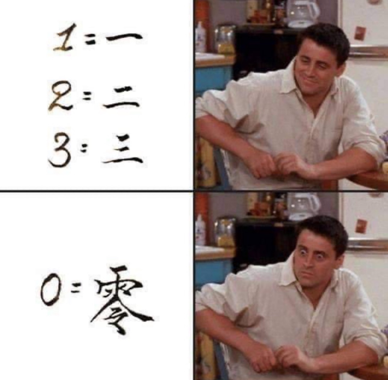
Yeah líng 零 is pretty annoying as a learner of the language.
The top character is yŭ 雨 which means rain. Confusingly, this is the semantic component - the part that contains the meaning of the character. Explained below.
The bottom character líng 令 means order/command as a noun and verb. This doesn’t add meaning, it is the phonetic component: basically a pronunciation cue.
It originally meant “light rain”/“falling in drops, like rain”, actually. It began being used to mean “fragments” or “leftover part”, then as “remainder” in the mathematical sense. Then, eventually, to mean 0. Another form of líng is 霝 which means raindrops. It has 3 kŏu 口 (“mouth”) characters on the bottom to visually represent drops.
So, like a lot of Chinese characters, it really only makes sense when you understand the etymology - and even then it’s kind of a stretch
The fact that such intricate characters can even be displayed in such tiny fonts is nothing short of obscene lol, I wonder if chinese phones all have that Assistive / Readability Mode where the text is enlarged and high contrast by default, because I can’t imagine reading texts like that haha
As someone who’s learned Japanese a bunch: once you’re very familiar with the symbols, you don’t look at every little line to determine what character it is, just the general shape. The characters are built by combining a discrete and smaller set of “drawings” (called radicals). So the space of possible characters is limited to those combinations. On top of that, not every legal combination actually exists. You won’t suddenly run into 鬱, but with a different radical in the bottom left, unless you’re playing a trivia game of “spot the mistake” (which can even be difficult for native speakers, just in the same way it can be difficult for native English speakers to spell some words they’d have no trouble reading.)
I would wager some misplaced lines wouldn’t hurt readabiliity much in the same way we, in English aren’t usually struggling to read a sentence even if some of the letters are swapped/missing or a “the” is duplicated, etc. I’m sure you’ve seen examples of that before in English (or your own native language if it isn’t English).
Of course in some instances, even a tiny difference can change the meaning of a sentence entirely. This is also true both in English and logographic languages. Luckily our brains do a lot of subconscious work here too and figure out where special attention is and isn’t needed by using context and knowledge about the writing system.
(Small caveat: of course, especially in languages, there are always exceptions to every rule. And also the brain can be tricked, intentionally or not, in a variety of ways.)
In OPs post, I see a stick figure guy pooping. Jack shit. Zero
Yeah it’s a visual metaphor - the emptiness of his bowels = the concept of zero shit in bowels
It actually originates from zero shits given.